Graphs are very common in motorsports data analysis. An image can represent a thousand words, a graph is a way to illustrate quantitative information. The data analysis guy (DAG, read more) is the responsible for organizing, filtering, and preparing the data. Hence, this is a kind of subjective activity. There are several types of graphs used by the data acquisition and analysis software for evaluation of the vehicle performance. This article proposes a review of these main graphs.
Time-distance and x-y
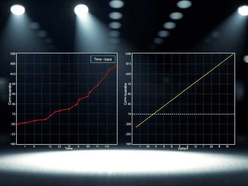
Figure 1 illustrates two different graphs, but these exhibit the same information. On the left there are the lateral and longitudinal accelerations as a function of time. At the right side there are the same accelerations, but these are correlated together. In addition, these graphs refer to the same point on the track. The decision about which one should be used is related to which information is desired. The left-side graph exhibits a higher amount of information. This is a time-distance graph; it is useful for statistics, while the second one is for design data, for instance. In this case, the right graph has the envelope of accelerations to which the car is exposed. The left-side graph is more synthetic, while the right one is more analytic. The acceleration envelope is not so detailed as the time-distance graph. Another point about this one is that it can provide some correlation between these parameters. In the G-G graph (Figure £, right side), there is no correlation.
Time or distance domain ?
In time-distance graphs usually it is possible to switch from the time to the distance domain. In the first, the interest is to understand when the events occurred, while the distance domain indicates where the events occurred. In comparison analysis it is preferable to perform it in the distance domain. However, the distance is obtained by relating speed and time, this can lead some differences between lap distances since if there are too much wheel locks. Hence, it should be verified the lap distance consistency.
It is possible to notice that, in Figure £, the shape of the velocity graph is very similar. However, since distance is the product between time and speed, there is no direct proportion between distance and time. As a result, in the distance domain the graph will exhibit compression and dilation of the plot at low and high speed, respectively. Hence, the distance plot is suggested for the comparison between different drivers assuming that, there is no significative wheel lock. In the case of comparison between different laps, the assumption is that the driver is running at the same racing line. The car setup can vary, but the racing line must be more or less the same. Although the car setup can be different, this can result in variations on the racing line. In addition, different driver with the same car and setup might race at different lines.
Histogram
Figure 3 illustrates two plots of the engine revs, one is exhibited in function of time, while the second one (bottom) is histogram of the engine revs (RPM). The histogram indicates the percentage of the time spent on a respective RPM. It can represent one lap, weekend or season.
Figure 4 illustrates another examples of histograms, but these are used to compare different tracks with respect to speed. This kind of comparison allows to identify the best gear rations, wing adjustments and track profiles. For instance, it is possible to create histogram to counts the events when the modulus of the lateral accelerations are than one, that means only cornering movements. An interesting histogram that can be created is the one that account low lateral and longitudinal accelerations, that is the coasting histogram. This is useful for evaluation of rookie drivers.
Tracks maps
Track maps can be plotted together with any channel. By selecting different colors, it is possible to identify the parameters and its value along the track. In addition, the same data is used to build run charts. These relate the outing laps with the parameters under evaluation, this could be the average lateral acceleration, the steering angle and even the lap times. Figure 5 illustrate being analyzed through the average steering angle. It is possible to notice that at the first outing the average value decreases, it increases in the second outing and then decreases again in the third one. Hence, there it seems that there is a balance variation that could be due to many reasons. For instance, it could be the driver adapting to the car behavior, the anti-roll bar adjustment or other tires compounds. Graphs like the one at Figure 5 can illustrates how the balance varies along an outing. Hence, it is important to fix the car setup before performing this analysis.
Tabular reports
The tabular reports are generated automatically. At each lap these provides information about the maximum and the minimum ranges. Hence, it is possible to compute information as minimum and maximum speed, oil temperature and battery voltage. In this way, it is not necessary to check every lap. The software compute those information and organize them. It is possible to set thresholds in order to define proper ranges. Another kind of tabular is the section times. The track is splitted in sections. These are pre-sets of lap distances at different points of the track.
Dilemma
Figure 7 illustrates two different approaches when entering in a corner. The dilemma is to decide which one is the fastest. The first point is to plot these information in the distance domain, because in time one the information about position is lost. The red car is breaking earlier and carrying more speed into the corner apex. The blue car is braking later, it is using the tire more violently in braking and reaching the apex more slowly. These are two different drivers techniques.
Conclusion
Basically, there are three kinds of graphs, the x-y, the time-distances and the histogram ones. Each of these can be used for different kind of analysis. Usually in the racing field these are used for comparisons. However, these can also be used for vehicle design, development and even drivers balance score card.
References
- This article was based in the lecture notes written by the author during the Applied Vehicle Dynamics lectures attended in Dallara Academy;
- Segers. J. Analisys Tequiniques for Racecar Data Acquisition, 1° Edição. Warrendale, PA. SAE International. 2008.
