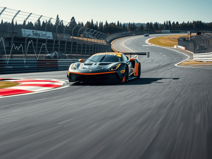
Once the main graphs used for data analysis are known, it is useful to understand its application for the main parameters used in race car data analysis. The approach that will be used in this article is to pick a base race track as reference. This is the Portland race track, which is a good one for this studying since it is flat, with no elevation, having all elements present in race tracks around the world. For instance, chicanes, long straights, high speed, low speed, easy flat and series of corners. In addition, the ones before and after a long straight. This article proposes an exercise for the main six channels in data analysis system using the Portland race track as an example.
Six basic channels
Any basic data acquisition system have the following six signals:
- Lateral acceleration;
- Longitudinal acceleration;
- Speed;
- Engine rotation per minute (RPM);
- Throttle application;
- Steering angle.
These signals are used by the data acquisition system and can be combined to create math channels in order to have complementary information.
Lateral acceleration (Gy)
The lateral acceleration (Gy) present in Figure 1 is a GT car during an outing. In this car the aero influence is small, thus there is no shear. The analysis exhibits that at the corners 1 and 2 there is a big decrease on the lateral acceleration. This is a clear example of mid corner oversteering. It is easy to notice that the corner 1 and 2 are actually one continuous corners. Hence, there is no straight between them. Even though this was the case, Gy signal is zero in the straights. Another reason is that this continuous is a kind of tight-wide-tight radius corner. The turn 3 is to the left side, thus the Gy sign changes, which is the reason why the value is rather the opposite of the previous corner. The turn 4 is to the right side, thus the Gy signal changes again. Hence, the sign of the lateral acceleration indicates from which side the car is turning. Corners 3 and 4 are a sequence ones. Then the car comes to the turn 5, which has a very pointy signal. For this corner, this signal means that it is an easy flat corner. It is not a grip limited one, instead it is a speed limited turn. For this reason the Gy curve for this kind of turn is different. The other corners were grip limited, which is the reason why they all reach the peak of Gy. The turn 6 is also speed limited, but to the other side, with respect to the corner 5. The turns 7, 8 and 9 are a sequence of grip limited corners. The turn 8 has a lower Gy than the following. The reason is that at the corner 8, the car is braking and cornering, thus the grip is being used for two movements. In the turn 9, the tire grip is being consumed only by the cornering maneuver. It is possible to notice that in all grip limited corners, the peak of the lateral acceleration is more or less the same.
Longitudinal acceleration (Gx)
Figure 2 illustrates the longitudinal acceleration around Portland race track. It is possible to notice that Gx is lower in acceleration than in deceleration. At the transition from the first to the second corner it is possible to spot a small deceleration. In this case, it is motivated by quick throttle lift. There are tyni valleys during the straight line acceleration. These are the effects due to the gear change, which are a small interruption of the longitudinal acceleration.
Speed
The speed information is one of the most common to be observed in the data analysis. In Figure 3 it is possible to notice the straight line acceleration and that the vehicle gains speed. In this graph it is not possible to identify the corners, despite the fact that with some experience the patterns can be recognized. The speed trace is one of the most important curves in race car data analysis. It is easy to perform comparisons between different driver, laps, cars and setups. When it is compared two laps in the distance domain using the speed trace, it is easy to compare the max speed, the brake point, the apex and the minimum speed. For this lap (Figure 3), it is possible to describe just observing the speed that there are two sections of high speed and an intermediate section with consecutive corners.
Engine revs (RPM)
The engine revs trace it is not commonly used alone. In this case, the speed trace delivers much more information. As seen in Figure 4, it seems that there are no constant points for the gear change. Actually, the RPM trace is a difficult choice to spot and identify the gear changes. Not all gear shifts occur at the same RPM. The reason is that sometimes the car is in the middle of the corner, thus the driver has to wait until the end of it. Therefore, the driver sometimes can not shift where he/she wants, but where it is possible.
Throttle
The throttle signal means longitudinal load transfer. In other words, the variation of the front and the rear wheel loads. Actually, the throttle is a major handling device for car balance. This is not obvious, but drivers control the balance of the car by the throttle. Since drivers have different style in activating the gas pedal, the car will exhibit different car balances according to who is the driver. Consequently, drivers complaint about the car differently. Hence, drivers choose the steering angle to achieve the equilibrium balance. The procedure is, first, the driver applies the throttle, then he/she set the longitudinal load transfer, the wheel loads and tires will generate grip according to these. Hence, the driver will find the right amount of steering angle to keep the car in equilibrium. Another clue of this dynamic is the Fourier analysis (read more), the throttle signal has a higher frequency with respect to the steering angle. Throttle comes first and there is only one steering angle that provides the equilibrium, in the bi-cycle model case. However, there are many possible throttle positions and for each one there is a different steering angle. Hence, wheel loads are not only function of the aerodynamics and the weight, but more importantly, the longitudinal load transfers. Bottom line, the throttle is the primary handling device.
Steering
The steering signal is seen in Figure 6. It is possible to notice quite easily the corners, while in the straights the value is zero. The lateral acceleration and the steering angle are obtained later, as in the steering pad. However, the difficulty is that each corner has a different radius and also along the same corner, the radius varies. If it is assumed the steady-state movements, a sequence of stationary maneuvers during a a given corner, there will be a sequence of different radii and steering inputs to keep the car in equilibrium. These are functions of the throttle inputs.
All six channels
Figure £ illustrates all those six channels together in an usual screen of the PI Toolbox software. Actually this screen represents the next step where everything is put together. This example is from the same track, Portland, but taken from a different car. In this case, it is an open wheel race car. An interesting detail about these data is the position of the beacon. It is positioned at the opposite side of the main straight. It is a particular characteristic of race tracks from the United States. The reason is the more convenience for the driver when opening a hot lap. With the beacon at that position fo the track, in the case of an aborted lap, there are just some corners until the pit. In addition, if the driver is performing cooldown lap, it is possible to do it until the beacon and then initiate another hot lap. In the graph it is also possible to spot the speed, Gy, Gx, RPM, Throttle, steering and lap distance. It is a quick look in all the main six parameters, that allows to make correlations.
Envelope
Previously it was seen the analysis of Gy and Gx or their correlations. However, there are other interesting correlations. Figure 8 illustrates the correlation of Gx with speed. This graph illustrates some common behaviors with respect to Gx. First, the longitudinal G decreases when speed goes up. The reason is that the engine power is consumed by the rolling resistance and aerodynamic drag. Hence, this graph allows to build the boundary lines in order to predict the speed as function of the longitudinal G. On the other hand, it is possible to notice that the longitudinal G increases during braking. This is a clear effect of the downforce. Hence, the envelope of Gy is a function of the speed.
Figure 9 illustrates a similar correlation, but between Gy and speed. The objective is to build the envelope of the lateral G as function of speed. In this case, Gy increases with speed due to the downforce. In case of a race car with a low downforce characteristic, this graph will not exhibit this increase. Hence, a Gy versus speed graph, which exhibit any increase of the lateral acceleration with speed, is a clue that the car has some aerodynamic device. With all those data, it is possible to create zones either in terms of Gy and Gx, which is the friction ellipsis, also known as G-G circle, and a histogram (Figure 10).
In this case it is possible to set different colors for each G range in order to build a histogram with the percentage of these during an outing. Whenever time is not considered, the information becomes a statistical one. The synthetic data do not account the time history, the sequences of events and where these occurred.
Time and speed variance
Time and speed variance is an important concept. Since it is possible to plot any channel versus distance and time, one of these should be selected. The dilemma (read more) of which one is faster usually results in the plot of the time versus distance (Figure 11). For instance, if there are two points, in this case lap distances, then it will have time 1, time 2 and delta time. This last one is what is usually desired when comparing different laps. In Figure 11, there is also the speed graph for different laps, but it is difficult to identify which one of these laps is the fastest. If it is possible to plot time versus distance for each lap, thus the time variance can be obtained. This difference of each lap time as function of the distance (Figure 11). In addition, it is possible to make any variance, time and speed. Hence, it is possible to create graphs with the speed of lap 1 and 2 versus distance and variance. This allows to spot, as function of distance, where the variance increases and decreases. The variance is a cumulative parameter (Figure 11), but it can also be plotted as an instantaneous one.
This data is not logged as function of distance, instead it is logged in function of time. Each of these it is logged time, thus each time the car pass through the real beacon, all those beacons will register the time at that beacon. Hence, it is not logged in function distance, it is logged in function of time. Since there are space and speed graphs, each time corresponds to a different distance. If two cars are traveling at slightly different speed, they will reach the same position at different time. For instance, Figure 12 illustrates two laps. The time is logged at a distance of 500 m each. Hence, it is possible to notice that there are two distance and two times. In that small second, it is possible to find which point corresponds to exactly 500 m and reversely get the time at 500 m. Then, it is possible to re-work the dataset and plot it as in function of distance. In addition, this allows to synchronize the events not in time, but in distance. This is done assuming that there is no wheel locks, spins and that the racing line is the same. Therefore, this procedure is a way to re-work the dataset in order to put it in the domain of distance. This can be done for any parameter. In this way, it is possible to compare two laps numerically, because the two curves from the speed channel (Figure 12) seem to be at the same distance. However, there is no guarantee that same time and same distance are logged. Actually, for each time it is logged the six channels. Or it is compared at the same distance, to check the variance, or it is offset the dataset for certain lap distance and then a numerical comparison can be done. Graphically, this process is quite simple, but numerically, it is necessary to synchronize it to the same lap. Hence, it could have a time variance for a specified lap distance.
For instance, the same variance process can be done for the speed channel. In this case, it is possible to visualize the speed variance in function of the distance. Figure 13 illustrates that occur a speed gain, because of the partial throttle situation highlighted. The reason of this partial throttle is easy to find. It is all in the data. Typically, drivers spend 70, 20 and 10 % of an outing on throttle, cornering and braking. The most important of these is in cornering. The reason is due to the fact that always there is a corner before a long straight. The speed exit is extremely important to the highest speed possible.
Conclusion
As can be seen, only six channels are enough to produce a huge amount of data. For this it is important to understand how prepare, organize and analyze the data. The understanding of the time variance is important to perform comparisons. The accelerations envelope is faster way to understand the performance of the car and if the driver is being to extract it.
References
- This article was based in the lecture notes written by the author during the Applied Vehicle Dynamics lectures attended in Dallara Academy;
- Segers. J. Analisys Tequiniques for Racecar Data Acquisition, 1° Edição. Warrendale, PA. SAE International. 2008.
